


Customize Labels Widget with Stylish Cool Effects

- Open your blogger dashboard.
- Select your blog.
- Select Template option.
- Click Edit HTML option.
- In the template code find ]]></b:skin>
- Now copy the code of any one design from the below given designs.
- Paste the copied code just above ]]></b:skin> and save the template
- Enjoy your new customized blogger labels.
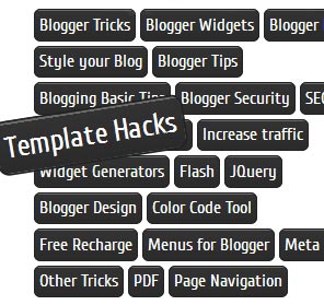
Black Forest Theme Labels With Animated Scaling
.Label li {
background: linear-gradient(to bottom, #6B6B6B 0%, #6B6B6B 4%, #333333 1%, #2B2B2B 100%) repeat scroll 0 0 transparent;
border: 1px solid;
border-radius: 6px 6px 6px 6px;
float: left;
font-size: 116%;
list-style: none outside none;
margin: 2px;
padding: 4px;
transition: all 0.3s ease 0s;
}
.Label li:hover {
transform: rotate(351deg) scale(1.7);
}
.Label a {color: #fff;text-decoration: none;}
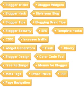
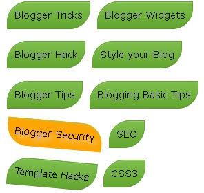
Yellow Customized Labels Widget
.Label li:before {
background-image: -moz-linear-gradient(left top , #FEDA71, #FEBA47);
border-bottom: 1px solid #D99D38;
border-left: 1px solid #D99D38;
content: "";
height: 1.39em;
left: -0.69em;
position: absolute;
top: 0.2em;
transform: rotate(45deg);
width: 1.3em;
z-index: 1;
}
.Label li:after {
background: none repeat scroll 0 0 #FFFFFF;
border: 1px solid #D99D38;
border-radius: 4.167em 4.167em 4.167em 4.167em;
box-shadow: 0 1px 0 #FAEABA;
content: "";
height: 0.5em;
left: -0.083em;
position: absolute;
top: 0.667em;
width: 0.5em;
z-index: 9999;
}
.Label li {
background-image: -moz-linear-gradient(center top , #FEDA71, #FEBA47);
border-bottom: 1px solid #D99D38;
border-radius: 0 0.25em 0.25em 0;
border-right: 1px solid #D99D38;
border-top: 1px solid #D99D38;
box-shadow: 0 1px 0 #FAEABA inset, 0 1px 1px rgba(0, 0, 0, 0.1);
color: #996633;
float: left;
font-family: 'Helvetica Neue',Helvetica,Arial,sans-serif;
font-size: 0.75em;
font-weight: bold;
list-style: none outside none;
margin: 0 0 7px 20px;
padding: 0.417em 0.417em 0.417em 0.917em;
position: relative;
text-decoration: none;
text-shadow: 0 1px 0 rgba(255, 255, 255, 0.4);
z-index: 1;
}
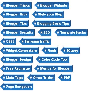
Blue Customized Labels Widget
.Label li:before {
background-image: -moz-linear-gradient(center top , #1E5799 0%, #207CCA 100%);
border-bottom: 1px solid #145091;
border-left: 1px solid #145091;
content: "";
height: 1.39em;
left: -0.69em;
position: absolute;
top: 0.2em;
transform: rotate(45deg);
width: 1.3em;
z-index: 1;
}
.Label li:after {
background: none repeat scroll 0 0 #FFFFFF;
border: 1px solid #3F6893;
border-radius: 4.167em 4.167em 4.167em 4.167em;
box-shadow: 0 1px 0 #B5D8FF;
content: "";
height: 0.5em;
left: -0.083em;
position: absolute;
top: 0.667em;
width: 0.5em;
z-index: 9999;
}
.Label li {
background-image: -moz-linear-gradient(center top , #1E5799, #207CCA);
border-bottom: 1px solid #145091;
border-radius: 0 0.25em 0.25em 0;
border-right: 1px solid #145091;
border-top: 1px solid #145091;
box-shadow: 0 1px 0 #CCE4FF inset, 0 1px 1px rgba(0, 0, 0, 0.1);
color: #996633;
float: left;
font-family: 'Helvetica Neue',Helvetica,Arial,sans-serif;
font-size: 0.75em;
font-weight: bold;
list-style: none outside none;
margin: 0 0 7px 20px;
padding: 0.417em 0.417em 0.417em 0.917em;
position: relative;
text-decoration: none;
text-shadow: 0 1px 0 rgba(255, 255, 255, 0.4);
z-index: 1;
}
Black Forest Theme Label Like NetOops Blog Labels
.Label li {
background: linear-gradient(to bottom, #6B6B6B 0%, #6B6B6B 4%, #333333 1%, #2B2B2B 100%) repeat scroll 0 0 transparent;
border: 1px solid;
border-radius: 6px 6px 6px 6px;
float: left;
font-size: 116%;
list-style: none outside none;
margin: 2px;
padding: 4px;
transition: all 0.3s ease 0s;
}
.Label li:hover {
transform: rotate(5deg);
}
.Label a {color: #fff;text-decoration: none;}
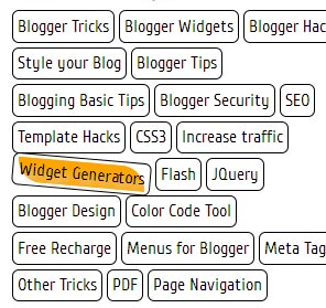
Skeleton Theme For Labels Widget
.Label a {
color: #000000;
text-decoration: none;
}
.Label li {
border: 1px solid #000;
border-radius: 6px 6px 6px 6px;
color: #000000 !important;
float: left;
font-size: 116%;
list-style: none outside none;
margin: 2px;
padding: 4px;
transition: all 0.3s ease 0s;
}
.Label li:hover {transform: rotate(5deg);}
Skeleton Theme With Painting Hover Effect
.Label a:hover
{
text-shadow:5px 5px 5px #dcdcdc;
background:orange;
border:1px solid orange;
border-bottom-right-radius: 0px;
border-top-left-radius: 0px;
border-bottom-left-radius: 30px;
border-top-right-radius: 30px;
}
.Label li {border: 1px solid;border-radius: 6px 6px 6px 6px;color: #000000 !important;float: left;font-size: 116%;list-style: none outside none;margin: 2px;padding: 4px;transition: all 0.3s ease 0s;}
.Label a {color: #000;text-decoration: none;}
.Label li:hover {transform: rotate(5deg);}
Leaf Theme For Labels Widget
.Label a {
-moz-border-bottom-colors: none;
-moz-border-left-colors: none;
-moz-border-right-colors: none;
-moz-border-top-colors: none;
background-color: #7FBF4D;
background-image: -moz-linear-gradient(center top , #7FBF4D, #63A62F);
border-bottom-right-radius: 30px;
border-color: #63A62F #63A62F #5B992B;
border-image: none;
border-style: solid;
border-top-left-radius: 30px;
border-width: 1px;
box-shadow: 0px 1px 0px 0px #96CA6D inset;
color: #FFFFFF;
float: left;
font: 14px verdana;
height: 18px;
margin-bottom: 9px;
margin-left: 10px;
padding: 10px;
position: relative;
text-decoration: none;
transition: all 0.5s ease-in-out 0s;
}
.Label a:hover {
background: none repeat scroll 0% 0% orange;
border-radius: 0px 30px 0px 30px;
border: 1px solid orange;
text-shadow: 5px 5px 5px #DCDCDC;
}
.Label {
margin: 0px;
padding: 0px;
position: relative;
}
.Label li:hover {
transform: rotate(5deg);
}
.Label li {
float: left;
font-size: 116%;
list-style: none outside none;
transition: all 0.3s ease 0s;
}


Glossy Pills Label

.label-size{
 margin:0;
 padding:0;
 position:relative;

 }
 .label-size a{
              float:left;
 height:18px;
 line-height:18px;
 position:relative;
 font:13px verdana;
 margin-bottom: 9px;
 margin-left:10px;
 padding:10px;
text-decoration:none;
  background-color: #ee432e;
  background-image: -webkit-gradient(linear, left top, left bottom, color-stop(0%, #ee432e), color-stop(50%, #c63929), color-stop(50%, #b51700), color-stop(100%, #891100));
  background-image: -webkit-linear-gradient(top, #ee432e 0%, #c63929 50%, #b51700 50%, #891100 100%);
  background-image: -moz-linear-gradient(top, #ee432e 0%, #c63929 50%, #b51700 50%, #891100 100%);
  background-image: -ms-linear-gradient(top, #ee432e 0%, #c63929 50%, #b51700 50%, #891100 100%);
  background-image: -o-linear-gradient(top, #ee432e 0%, #c63929 50%, #b51700 50%, #891100 100%);
  background-image: linear-gradient(top, #ee432e 0%, #c63929 50%, #b51700 50%, #891100 100%);
  border: 1px solid #951100;
  -webkit-border-radius: 30px;
  -moz-border-radius: 30px;
  border-radius: 30px;
  -webkit-box-shadow: inset 0px 0px 0px 1px rgba(255, 115, 100, 0.4), 0 1px 3px #333333;
  -moz-box-shadow: inset 0px 0px 0px 1px rgba(255, 115, 100, 0.4), 0 1px 3px #333333;
  box-shadow: inset 0px 0px 0px 1px rgba(255, 115, 100, 0.4), 0 1px 3px #333333;
  color: #fff;
  font: bold 14px "helvetica neue", helvetica, arial, sans-serif;
   text-align: center;
  text-shadow: 0px -1px 1px rgba(0, 0, 0, 0.8);
  }
  .label-size a:hover {
    background-color: #f37873;
    background-image: -webkit-gradient(linear, left top, left bottom, color-stop(0%, #f37873), color-stop(50%, #db504d), color-stop(50%, #cb0500), color-stop(100%, #a20601));
    background-image: -webkit-linear-gradient(top, #f37873 0%, #db504d 50%, #cb0500 50%, #a20601 100%);
    background-image: -moz-linear-gradient(top, #f37873 0%, #db504d 50%, #cb0500 50%, #a20601 100%);
    background-image: -ms-linear-gradient(top, #f37873 0%, #db504d 50%, #cb0500 50%, #a20601 100%);
    background-image: -o-linear-gradient(top, #f37873 0%, #db504d 50%, #cb0500 50%, #a20601 100%);
    background-image: linear-gradient(top, #f37873 0%, #db504d 50%, #cb0500 50%, #a20601 100%);
     }
Clean Labels

.label-size{
 margin:0;
 padding:0;
 position:relative;
 }
 .label-size a{
text-decoration:none;
 float:left;
 height:18px;
 line-height:18px;
 position:relative;
 margin-bottom: 9px;
 margin-left:10px;
 padding:10px;
  background-color: #eeeeee;
  background-image: -webkit-gradient(linear, left top, left bottom, color-stop(0%, #eeeeee), color-stop(100%, #cccccc));
  background-image: -webkit-linear-gradient(top, #eeeeee, #cccccc);
  background-image: -moz-linear-gradient(top, #eeeeee, #cccccc);
  background-image: -ms-linear-gradient(top, #eeeeee, #cccccc);
  background-image: -o-linear-gradient(top, #eeeeee, #cccccc);
  background-image: linear-gradient(top, #eeeeee, #cccccc);
  border: 1px solid #ccc;
  border-bottom: 1px solid #bbb;
  -webkit-border-radius: 3px;
  -moz-border-radius: 3px;
  border-radius: 3px;
  color: #333;
  font: bold 12px verdana;
    text-align: center;
  text-shadow: 0 1px 0 #eee;
  }
  .label-size a:hover {
    background-color: #dddddd;
    background-image: -webkit-gradient(linear, left top, left bottom, color-stop(0%, #dddddd), color-stop(100%, #bbbbbb));
    background-image: -webkit-linear-gradient(top, #dddddd, #bbbbbb);
    background-image: -moz-linear-gradient(top, #dddddd, #bbbbbb);
    background-image: -ms-linear-gradient(top, #dddddd, #bbbbbb);
    background-image: -o-linear-gradient(top, #dddddd, #bbbbbb);
    background-image: linear-gradient(top, #dddddd, #bbbbbb);
    border: 1px solid #bbb;
    border-bottom: 1px solid #999;
        text-shadow: 0 1px 0 #ddd; }
  button.clean-gray:active {
    border: 1px solid #aaa;
    border-bottom: 1px solid #888;
    -webkit-box-shadow: inset 0 0 5px 2px #aaaaaa, 0 1px 0 0 #eeeeee;
    -moz-box-shadow: inset 0 0 5px 2px #aaaaaa, 0 1px 0 0 #eeeeee;
    box-shadow: inset 0 0 5px 2px #aaaaaa, 0 1px 0 0 #eeeeee; }
Animated Border Style Labels

.label-size{
 margin:0;
 padding:0;
 position:relative;

 }
 .label-size a{
 float:left;
 height:18px;
 line-height:18px;
 position:relative;
 font:14px verdana;
 margin-bottom: 9px;
 margin-left:10px;
 padding:10px;
 color: #fff;
 background: #48C9FF;
 background: -webkit-linear-gradient(top, #48C9FF 0%, #2EA8E5 100%);
 background: -moz-linear-gradient(top, #48C9FF 0%, #2EA8E5 100%);
 background: -ms-linear-gradient(top, #48C9FF 0%, #2EA8E5 100%);
 background: -o-linear-gradient(top, #48C9FF 0%, #2EA8E5 100%);
 background: linear-gradient(to bottom, #48C9FF 0%, #2EA8E5 100%);
 text-shadow: #29a3cc 0 1px 3px;
 text-decoration:none;
 border-top-left-radius: 10px 50px;
 border-bottom-left-radius: 10px 50px;
 border-top-right-radius: 10px 50px;
 border-bottom-right-radius: 10px 50px;
 -moz-border-radius-topleft: 10px 50px;
 -moz-border-radius-topright: 10px 50px;
 -moz-border-radius-bottomright: 10px 50px;
 -moz-border-radius-bottomleft: 10px 50px;
 -webkit-transition: all 0.5s ease;
 -moz-transition: all 0.5s ease;
 -ms-transition: all 0.5s ease;
 -o-transition: all 0.5s ease;
 transition: all 0.5s ease;
 }

.label-size a:hover
{
 -moz-border-radius-topleft: 50px 50px;
 -moz-border-radius-topright: 50px 50px;
 -moz-border-radius-bottomright: 50px 50px;
 -moz-border-radius-bottomleft: 50px 50px;
 border-top-left-radius: 50px 50px;
 border-bottom-left-radius: 50px 50px;
 border-top-right-radius: 50px 50px;
 border-bottom-right-radius: 50px 50px;
}
Button Style Labels

.label-size{
 margin:0;
 padding:0;
 position:relative;

 }
 .label-size a{
              float:left;
 height:18px;
 line-height:18px;
 position:relative;
 font:13px verdana;
 margin-bottom: 9px;
 margin-left:10px;
 padding:10px;
	text-decoration:none;
	background-color: #ff4c47;
	border-radius: 3px;
	box-shadow: 0 2px 0 #db443d;
	-moz-box-shadow: 0 2px 0 #db443d;
	-webkit-box-shadow: 0 2px 0 #db443d;
	color: #fff;

	text-align: center;
}

.label-size a:hover {
	background-color: #db443d;
}

No comments:
Post a Comment
Please feel free to comment regards this post